Brand identity
Tondo
TONDO is a home made bakery, founded by Silvia Cancellieri, expert baker, who has brought her professional project to life.
I took into consideration different elements to identify the brand:
_ the human element, symbol of handmade
_ the ear/bread, to connect to the core business objective, to bread production and bread products.
It was important to remember how much the attention was paid to choosing ingredients.
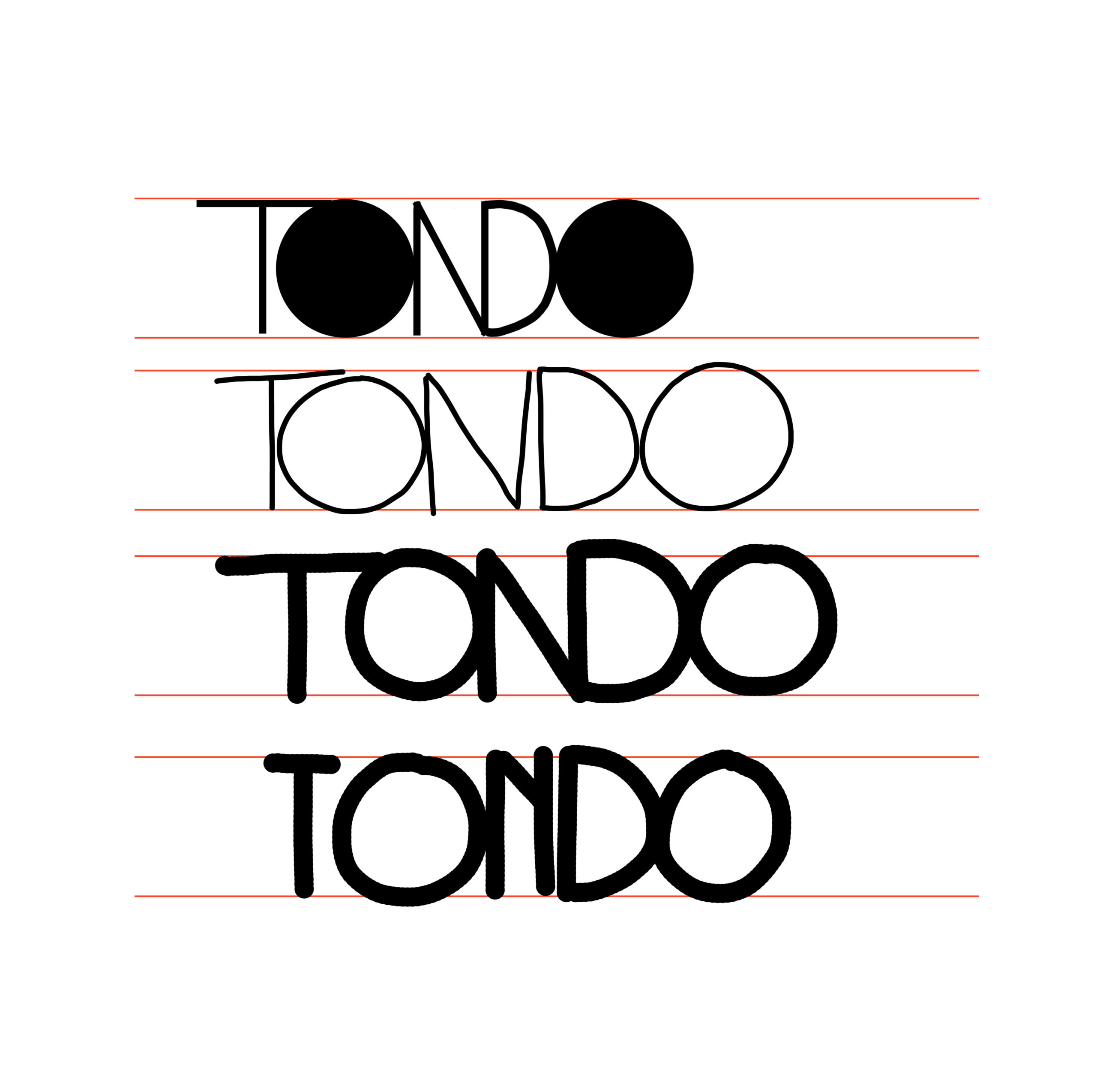
_ the geometrical shape of the circle, of course.
Considering these elements, I wanted to emphasize the originality of the work done by Silvia Cancellieri, owner of the business.
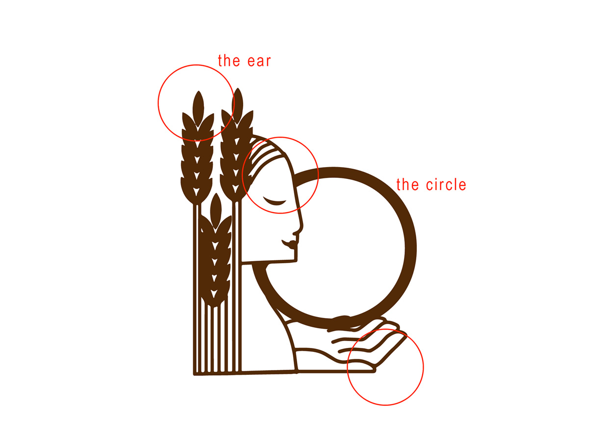
The result of this research is a pictogram that shows a woman with hair in the shape of an ear of corn.
She has her eyes closed.
This is an archetypical symbol and represents the ability to do things in a capable and instinctive way: the production of bread, in this case.
The large hand open upwards also symbolizes the care given in product.
The definitive brands.

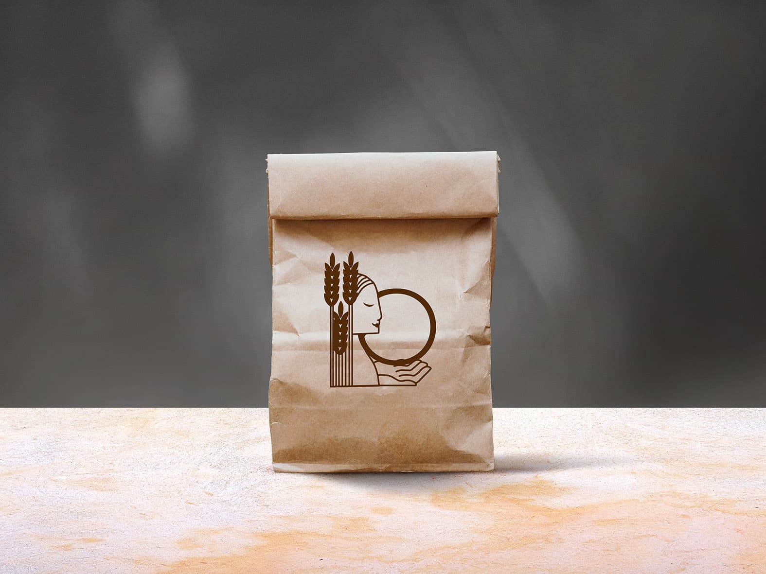
Naturally the geometric structure of the circle gives harmony of the brand.
An example of a paper bread bag.
The fonts used are both license-free and are Montserrat Alternates Light, designed by Julieta Ulanovsky together with the tiny Arial Narrow font, designed by Robin Nicholas and Patricia Sauders.
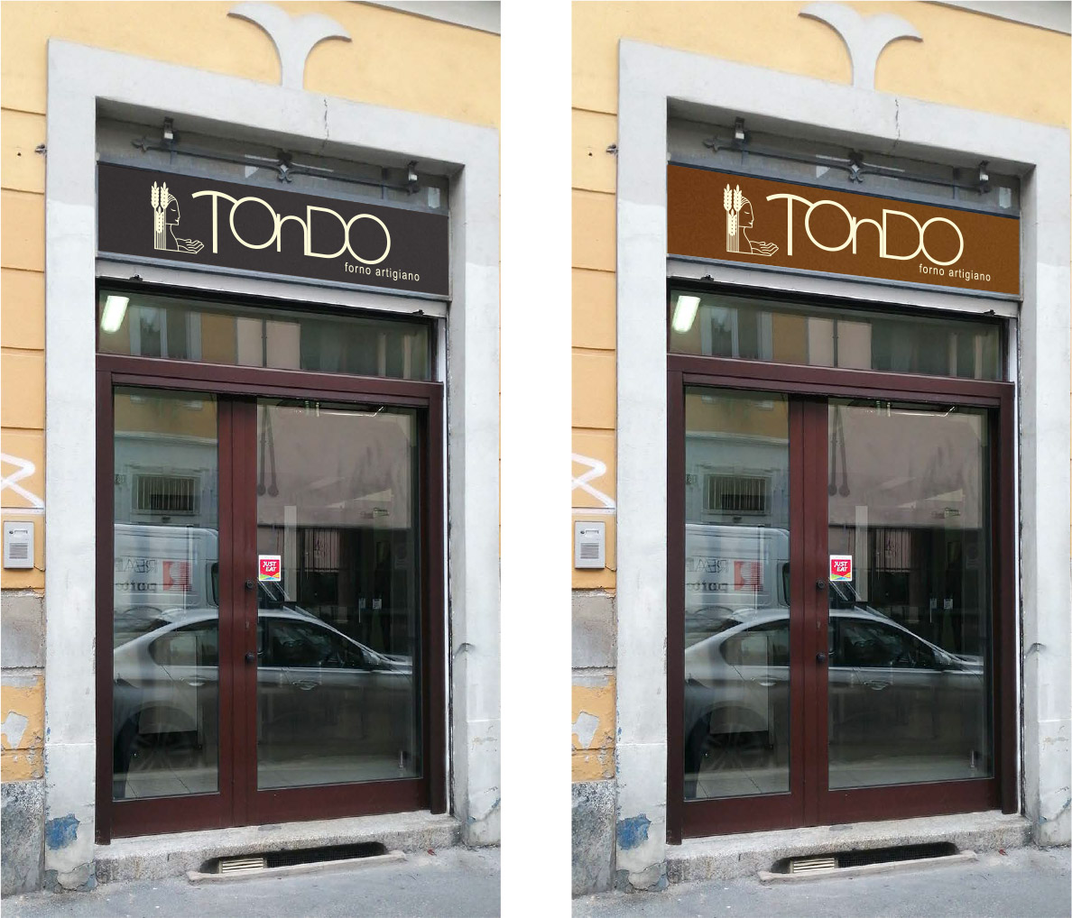
The shop signs.
Photo by Antiche insegne artigiane
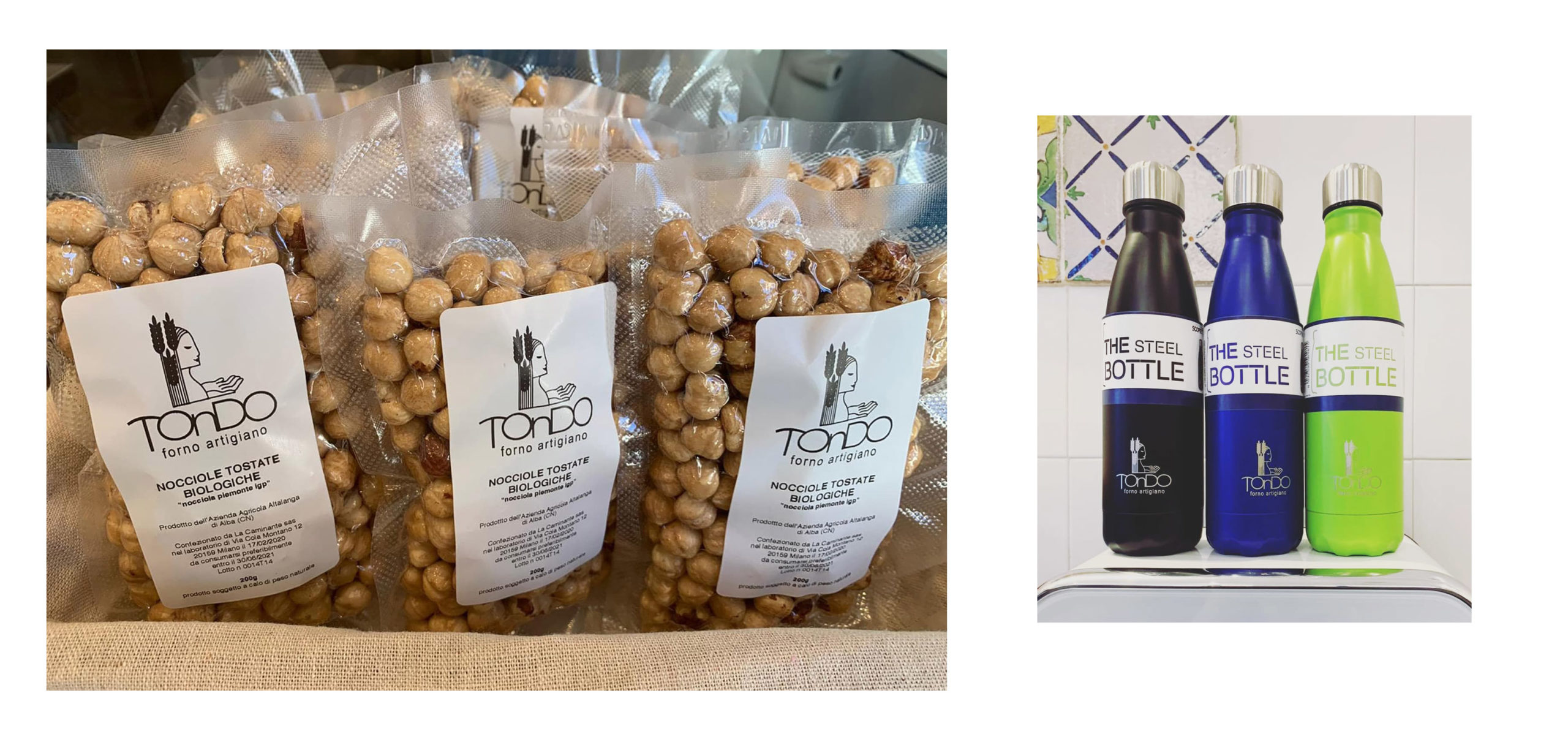
Some branded products.

The simulation of a marked bread.
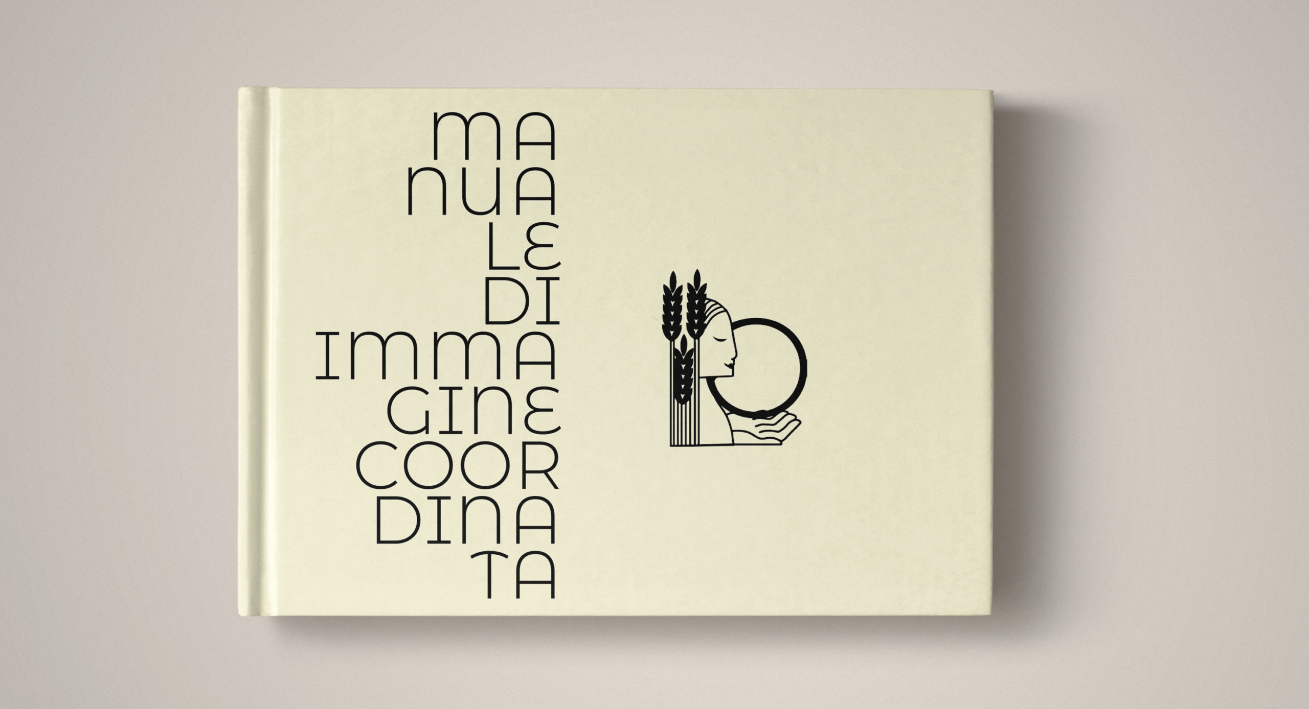
Here you can download the TONDO brand identity bible.
